Black and white posters: 10 ways to pair them with your decor
With no color to match, a black and white poster fits in almost anywhere. The Brunelia posters that come closest, in monochrome and muted tones, and how to pair them with the rest of the room.

Key points
- 62 posters in the Art Deco posters collection, the 20 from this article in the table below.
- From 19,95 € in A4, up to 69,95 € in A0, 5 sizes for each poster.
- Printed in Europe on demand, free delivery from 59 €.
The table
The 20 posters at a glance




Why black and white goes with almost everything
A black and white poster doesn’t impose any color to match in the room: it sticks to shades of gray, from white to black. That makes it easier to place than a very colorful poster, whether in an interior already full of color or in a more neutral one.

The black and white poster families at Brunelia
At Brunelia, no poster is strictly black and white: this spirit comes through in two-tone palettes and muted tones, in 2 forms. The gray monochrome, like the surfer swept up by a giant wave. And the grisaille lifted by a single touch of light or color, like the covered passages of Paris or the cobbled streets gleaming with rain, with their black umbrellas and street lamps.
Pairing black and white with the rest of the room
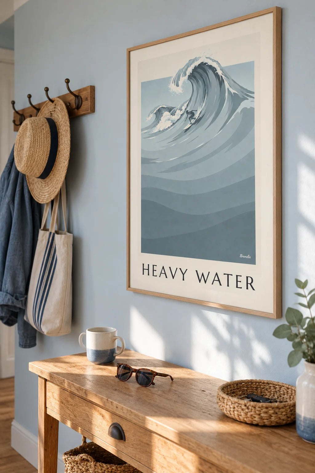
A thin black frame heightens the contrast and gives a graphic look. A light wood frame softens the whole if the room is already dark. In a colorful interior, the black and white poster acts as a visual breather between 2 busier areas.

On its own or in a gallery wall
A black and white poster can stand on its own on a neutral wall. Combined with other sizes in a gallery wall, it pairs with colorful posters without clashing, as long as you keep the same type of frame to unify the whole. The A3 size suits most single-poster walls; for a gallery wall combining several sizes, A4 makes grid layouts easier.

The poster for this part
Vivienne Gallery covered passage and glass roof in Paris poster
from 19,95 €
The surfer in the wave, a monochrome of grays
The Heavy Water poster shows a tiny surfer gliding beneath an immense wave, entirely in shades of gray, from the white of the foam to the slate gray of the ocean. It’s the closest to true black and white, and it sits effortlessly beside very colorful posters.
The Galerie Vivienne, architecture in grisaille
The poster of the Galerie Vivienne in Paris plays on the grays of the glass roof and the arcades, warmed only by the golden shop windows and a passerby at the end of the passage: almost monochrome historic architecture that works as well with a colorful interior as with a neutral setting.
A rainy night, film noir style
The Endless Duel poster sets 2 silhouettes in raincoats face to face under a street lamp, on cobblestones gleaming with rain: very dark blues and grays, with the lantern’s yellow as the only light. A black and white cinema spirit, more narrative than the architecture or the wave described above.

Build this wall
3 posters from this article, at true scale


All 3 posters: 99,85 €
Frequently asked questions
You often ask us
Does black and white go with an already very colorful interior?
Yes, that’s exactly one of its strengths: with no color of its own, it doesn’t compete with the shades already in the room.
Which frame should I choose for a black and white poster?
A thin black frame strengthens the contrast and the graphic feel. A light wood frame softens the look if the rest of the room is already dark.
Keep exploring